The global agency gives the challenger telecoms brand a bolder, greener identity built around a simple signpost.
Giffgaff is a UK-based mobile operator that has gradually grown into a broadband provider, with more than 4 million members. Although it’s been part of Virgin Media O2 since the two big brands merged in 2021, it still sees itself as a challenger brand.
So what’s so different about it? Its main selling point is flexibility. While it does offer longer contracts on phones and broadband, most of its SIM plans are monthly rolling or pay-as-you-go, meaning you can switch plans month to month without huge fees.
Giffgaff also doesn’t do mid-contract price rises, lets members switch plans up or down if their circumstances change, and even tells them if a cheaper plan would suit them better. EU roaming of up to 5GB is included on plans, too.
The company is also a certified B Corporation and emphasises sustainability in the way it operates. For instance, it sells refurbished phones alongside new ones.
Rebranding a challenger brand, though, is always a bit of a, well, challenge. Change things too much, and you lose the quirky personality that attracted people to sign up in the first place. Change things too little, and… what’s the point?
That’s the balancing act global creative agency Koto faced. With new entrants crowding into an already competitive market, Giffgaff asked it to set the brand up for its next chapter while holding on to what makes it different.
Logo design
That signpost is in the new wordmark, although you might not spot it if you’re not looking carefully. The final ‘f’ now ends in a pointed tip, turning it into a little arrow. That shape is also peppered throughout the whole identity, directing the eye to prices, pointing to offers and generally helping users work out where to go and what to do next.
“Giffgaff has always had a strong personality,” says Joe Ling, creative director at Koto. “The challenge was to give it room to evolve without losing the energy and attitude that makes it unmistakable. We took the idea of helping members decide what’s next, and expressed it through a simple signpost.
“Built into the logo and carried through the wider system, it gives the identity a clear organising idea that feels distinctive to Giffgaff while playing a practical role in all its communications.” The device, by the way, works just as well off screen. For example, green packing tape printed with a “Your Next Move” slogan is slapped across brown cardboard parcels. It’s just the kind of little, well-thought-out touch that makes an identity feel lived-in.
Colours, type and photography
As for the colour scheme, the familiar black-and-white palette is now joined by a feisty dose of acid green. This gives the brand renewed confidence and helps it stand out in a market that’s typically characterised by blues, reds and purples.
Koto has also created a custom font, Giffsans: a tall, condensed and punchy sans that gives snappy slogans like “Great tech. No traps.” the impact they need to land. A distinctive ‘gg’ ligature, meanwhile, connects back to the original logo in a way that feels natural.
In terms of photography, Koto has avoided the trap of glossy stock shots and gone for a candid, flash-lit, TikTok feel instead. We’re talking friends with arms around each other, a couple laughing on a night out, two sunburnt older men in swim shorts by the sea. None of it looks professionally shot; instead, it feels like it was created by normal people in the moment, which suits a brand that leans heavily into community.
Digital system
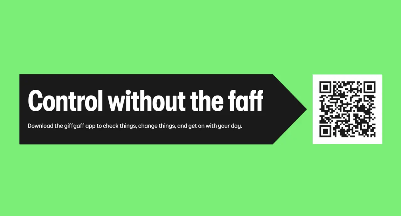
As for the all-important website and app, Koto has also delivered a system that’s suitably simple to follow and use, without losing the quirky personality, which is a tough tightrope to walk. Importantly, it’s built on Giffgaff’s existing design tokens and ready for development from day one, so it can be rolled out rather than sitting in a deck. An app promo asks you to take “Control without the faff”, which is exactly the sort of Giffgaff language users will expect.
“Our over 4 million members have always been at the heart of Giffgaff, and this next chapter is no different,” says Georgina Bramall, chief marketing officer at Giffgaff. “We’ve earned their trust by looking after them, and we want to keep earning it as their lives change. The category can feel needlessly complicated, so this new look and feel takes what people already love about us and makes it even simpler, bolder and relevant, delivering value you can see straight away.”
“A good deal gives people a reason to look,” says James Greenfield, founder and CEO of Koto. “With Giffgaff we wanted to bring their character to life, brand and offer reinforcing each other. It’s about remembering what unmistakably Giffgaff feels like.”
The refresh is rolling out across Giffgaff’s website, app and email campaigns, and its upcoming Black Friday campaign will be a big test of the system in action. It’s all part of a longer-term partnership between the two companies, with Koto continuing to develop Giffgaff’s brand strategy and identity as the business evolves.
Leave a Reply