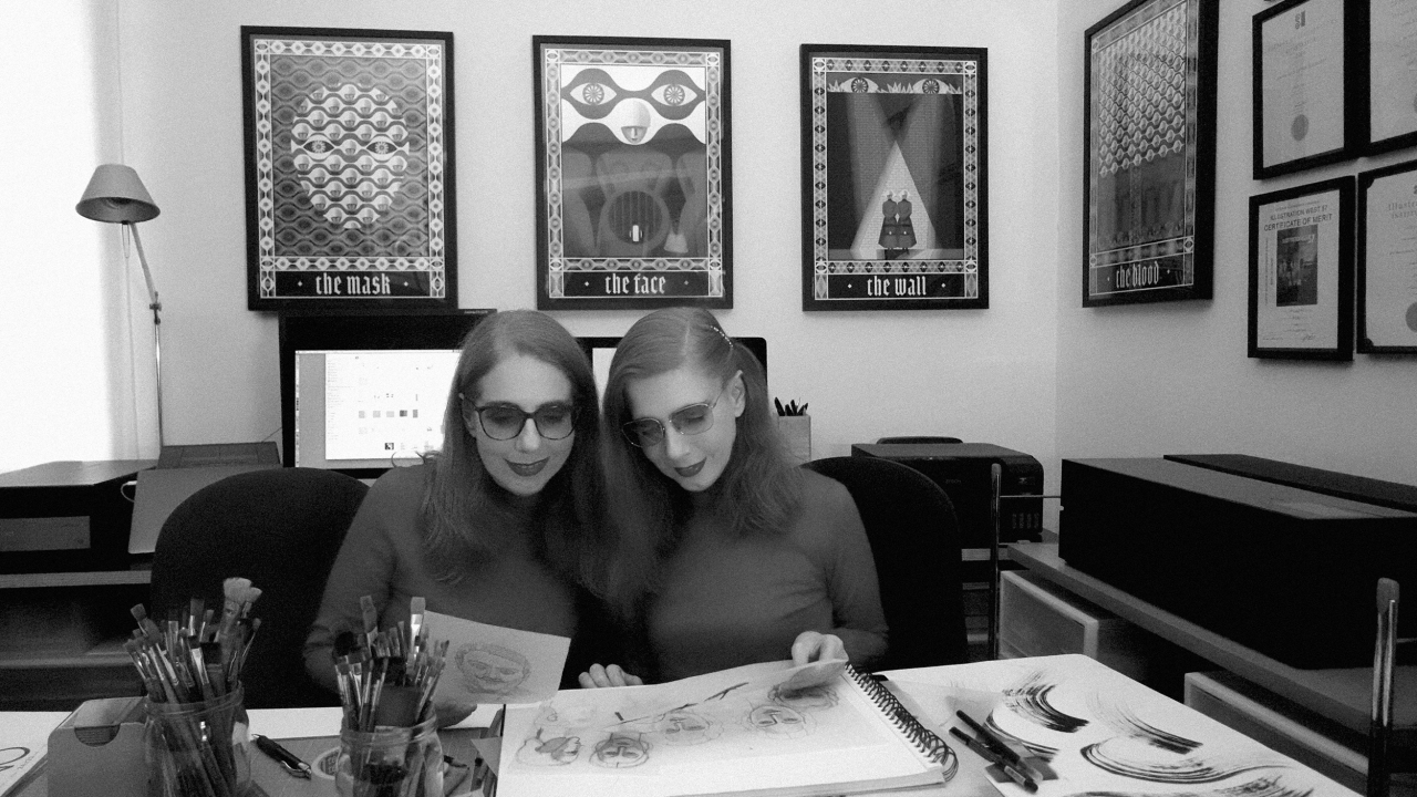
Anna and Elena share their process, influences and hard-won lessons from returning to Gilead for Folio Society’s new limited edition.
Few illustrators get the chance to revisit one of their most celebrated projects more than a decade later. But that’s what happened to Anna and Elena Balbusso, the Milan-based duo known as the Balbusso Twins.
In 2012, they illustrated Folio Society’s edition of Margaret Atwood’s The Handmaid’s Tale, which won them a gold medal from the Society of Illustrators. Now they’ve returned to Gilead, the dystopian nation in which the classic novel is set, for a new limited-edition box set that brings together the novel with its sequel, The Testaments.
Their original Handmaid’s Tale illustrations are joined by a new ninth plate, and there’s a fresh set of illustrations for The Testaments, all housed in a newly designed clamshell box.
This caps a triumphant year for the twins. They not only celebrated their 25th anniversary, but also extended their first solo exhibition in New York by nine weeks due to popular demand. They also became the first Italian artists to win the Society of Illustrators’ Hamilton King Award.
Anna and Elena Balbusso, aka the Balbusso Twins
Here, the duo reveal how they approached the Folio Society project, and what other creatives might learn from it. (Note: contains mild spoilers for the books if you haven’t read them yet.)
Think like a director
They begin with an interesting comparison. “For us, creating illustrated books is very much like making a film. After carefully reading the story, we select the scenes we want to illustrate, choosing compelling narrative points that allow us to express our most authentic interpretation while balancing the total number of illustrations throughout the entire book.”
These choices, then, are in no way trivial. “The selection of scenes defines what we wish to communicate. It is deeply bound to our creative intuition and is fundamental to the project, as it represents the artist’s genuine emotional point of view: their very soul and sensibility.”
From there, the twins begin to build out an entire world, just as a film crew would. For the novels, “we had to build an entire, comprehensive world: imagining the characters, the environments, the costumes, the set design, the cinematography and the overall colour palette”
Artistic licence
Interestingly, though, they don’t see their job as simply depicting what’s on the page. “We intentionally reject a purely literal or educational approach to illustration,” they say.
“We believe the image carries the exact same artistic value as the written text; it must never serve a subordinate role, but must add an authentic, independent artistic interpretation: a new, autonomous point of view. In this sense, total creative freedom in the choice of subjects and style is essential to our creative process.”
Taking The Handmaid’s Tale as an example, author Margaret Atwood set her story in a world of Georgian and Victorian architecture. Instead, the twins swapped it for the hard lines and angles of Russian Constructivism and Italian Futurism.
“Replacing the colonial decorative framework of the narrative with the geometry of straight lines and angles of the avant-gardes allowed us to visually amplify the sense of totalitarian oppression,” they say.
The most striking liberty they’ve taken to date is with The Wall, where corpses of the Gilead regime’s enemies are hung for all to see. For the 2012 book, they turned it red, while admitting: “In Atwood’s novel, there is no chromatic reference to a red wall—she only mentions the old Harvard stone wall. Yet our pictorial intuition was so powerful that it became deeply rooted in the collective visual imagination, subsequently appearing in the 2017 television series and the work of other artists.
“Likewise, our choice of an essential silhouette interpretation for the cover of The Handmaid’s Tale became an iconographic milestone that subsequently inspired covers of the same novel.”
How they research
At the start of a project, the twins approach each project like researchers, going “directly to historical and iconographical sources. In all our work, the absolute foundation is the history of art.”
Here, along with Russian Constructivists such as Kazimir Malevich and the Italian Futurists, they’ve drawn on the volumes and light of Piero della Francesca and the solemn weight of the Novecento Italiano painters Felice Casorati and Mario Sironi.
The Testaments, meanwhile, brought a new influence: “Surrealism, a component that was entirely absent from our first book. If the guiding thread of these new artworks for The Testaments could be distilled into a single word, it would be Nightmare.”
That surreal streak shows up in the new plates. A disembodied hand emerges from a dentist’s chair, the sky fills with watchful eyes, and the guards known as the Eyes wear headgear shaped like a giant eye.
Avoiding shortcuts
The twins’ technique combines traditional and digital methods, but they’re scathing about anything that smacks of automation. “There are no shortcuts, no tricks and no virtual filters or ready-made brushes: only intense, time-consuming hard work, profound dedication, patience and care,” they say.
Typically, that means using pencil, pen, watercolour, gouache and tempera, then bringing them together in Photoshop. They also spray acrylic onto paper and scan it to create gradients with a subtle analogue grain. “Each texture and brushstroke is created by hand on paper, then scanned and layered,” they say. “The colour is built in depth, mimicking the texture of a traditional fresco where the physical depth of the raw pigments can be visually perceived.”
Colour carries much of the narrative weight. For the first book, the twins limited their palette to white, black, grey and red. “For us, colour is a living being; reducing the colour palette mirrors the totalitarian reduction of freedom of thought,” they say.
For The Testaments, they’ve expanded this in line with Gilead’s own rules: green for girls ready for marriage, grey for Pearl Girls and pink for schoolchildren. That colour-coding also shapes the minimalist, Constructivist-inspired slipcase and covers, where the green and grey of The Testaments act as a counterpoint to the Handmaid’s Tale red.
Adding callbacks
Returning to a project after so long also gave the twins a chance to create visual callbacks. In the new frontispiece, the young Agnes holds a doll of a pregnant handmaid, an echo of their award-winning 2012 frontispiece, Pregnant.
“That powerful maternal figure now becomes a toy or fetish in the hands of her daughter, who evokes her biological mother Offred through the only facsimile allowed by the regime.”
They also added a new ninth illustration to The Handmaid’s Tale, showing the Eyes arriving to take Offred away. This mirrors the final plate of The Testaments, in which the same armed guards cross paths with the Aunt in the dead of night shortly before her arrest. “We established a direct, symmetrical dialogue with the closing illustration of The Testaments, anchoring the entire saga,” they say.
Margaret Atwood has made her approval clear, writing in her introduction: “It’s fitting that the illustrations in this Folio edition echo both the feel and the colour palette of the thirties and forties, the age of the rise of the major dictatorships.”
Collector’s piece
The finished edition is limited to 750 copies, each hand-signed by the twins. With suitable theatrical flourish, these were printed by Venice’s oldest book printer, then taken out of the city by gondola to be bound in leather by Graphicom. The publication also features a foreword by British writer Naomi Alderman, author of The Power, another modern classic of speculative fiction.
For the twins, this project offered the opportunity to show that illustrators needn’t be pigeonholed. “We are not artists confined to so-called ‘female’ genres,” they say. “We tackle any literary text without boundaries.”
Leave a Reply