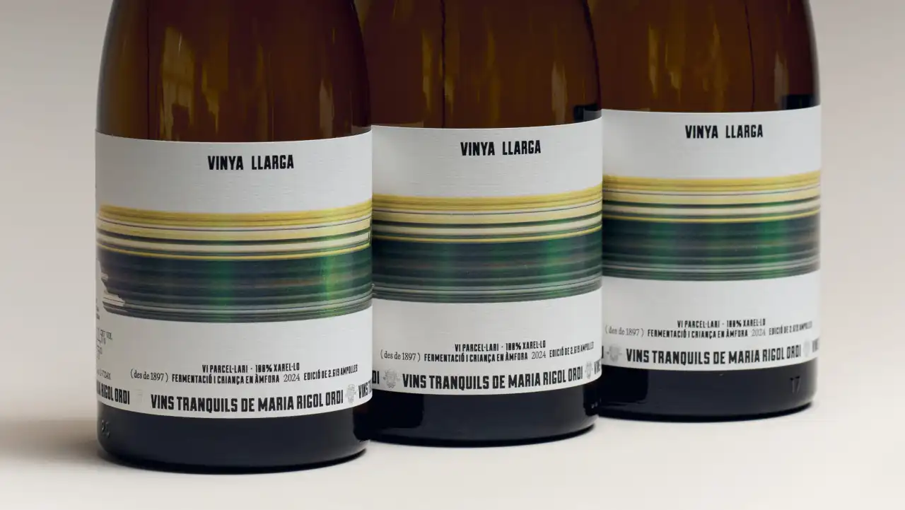
The design for Maria Rigol Ordi’s first still wine takes the name’s literal meaning and runs with it.
Creatives often wax lyrical about finding inspiration in the most unlikely of places: a rusty shipping container, a 1970s cookbook, the pattern on their nan’s old curtains. All of which is lovely. But sometimes the best, most obvious ideas are right in front of you. And having the confidence to simply reach out and take it is a creative skill in itself.
Here’s a great example. When Barcelona studio Atipus was asked to create the label for a wine called Vinya Llarga, it didn’t have to look further than the name.
Vinya Llarga translates from Catalan as “long vineyard”. It’s the first still wine from Maria Rigol Ordi, a producer based in Sant Sadurní d’Anoia in the Penedès region of Catalonia, known for specialising in cava.
As Fabiola Ureña of Atipus explains, that made it a big deal for the brand. “The challenge for this launch product, the first in a new territory, was to design a label that could reflect a new chapter with the same care for craft, but with a fresh point of view.”
The main feature of the label is something that’s literally “long”: a band of yellow, green and blue streaks that runs right around the bottle. It looks a bit like a photo taken from a fast-moving train: you can just about make out a landscape, but mostly you see bands of colour. On the back label, the streaks resolve into something leafy and green, as if the scene is coming back into focus.
Sense of restraint
Importantly, the other elements in the design are deliberately restrained. The words “Vinya Llarga” sit in small, condensed capitals at the top of the textured white label, with the producer’s name, Vins tranquils de Maria Rigol Ordi, running along the bottom.
Details including the grape, fermentation and the size of the limited run are set in small type in between, along with a nod to the vineyard’s history dating back to 1897.
As Fabiola explains: “The bold colour gives the bottle a strong presence, creating immediate visual impact without losing its sense of warmth. The wax-sealed capsule adds a tactile, handcrafted detail. Together, these elements strike a balance between tradition and a more expressive, modern attitude.”
“A simple idea allowed us to build a wine with character, rhythm and a playful edge,” she concludes, “giving Vinya Llarga a distinctive presence while keeping the wine at the heart of it all.”
Leave a Reply