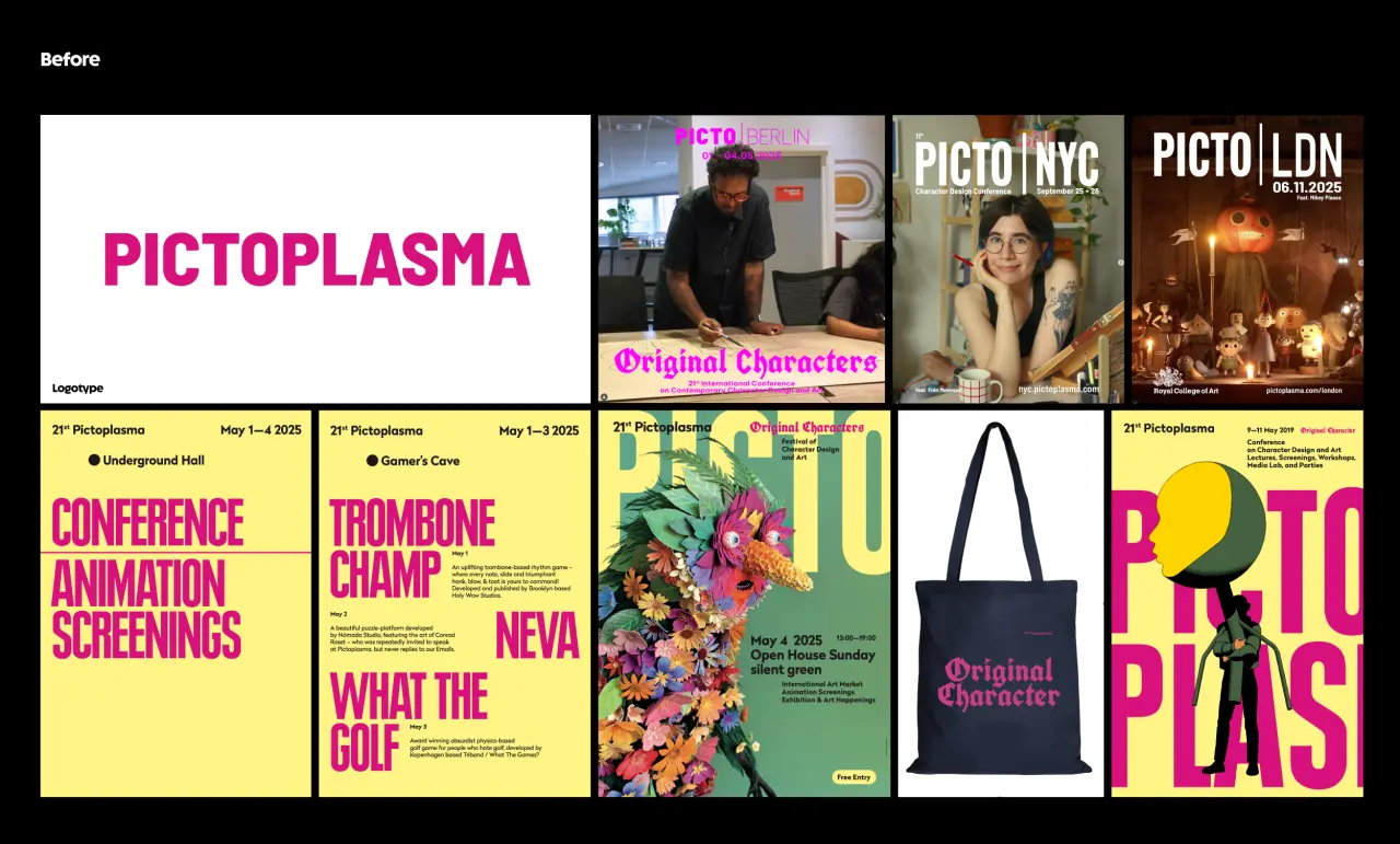
andstudio gives Berlin’s character design festival a brand new look, built entirely from type.
From childhood, most of us will be familiar with seeing a man in the moon. When you analyse it logically, there’s nothing in our nearest astronomical neighbour that looks remotely like a face. But our brains are wired to see faces in everything, from a power socket to the front grille of a car to a house with two windows and a door.
It’s a phenomenon known as pareidolia, and it came in handy recently at andstudio, a creative agency based in Vilnius, Lithuania, which has developed a new identity for Pictoplasma, the Berlin festival of character design.
If you’ve never heard of Pictoplasma, we heartily recommend attending, and you can learn more by reading our special report from this year’s edition. It actually began life in 1999 as an online archive of character design, before founders Peter Thaler and Lars Denicke launched a conference in 2004, which later expanded to New York and London.
Pictoplasma is about the artists and their characters, so it’s always kept its own branding firmly in the background. andstudio’s challenge in 2026, then, was to breathe new life into the identity, without taking focus away from the work it aims to showcase. A tricky balance to strike, and no mistake.
A meeting of minds
The two teams met at a conference for conference organisers, which that year happened to be in Vilnius. A dinner led to further chats, and before long a working relationship.
The studio was initially only planning to work on strategy rather than identity. And there was good reason to start there: with cultural budgets in Europe getting smaller, and festivals losing funding every year, Pictoplasma wanted to reach more people without losing the playful, offbeat spirit its community loves.
To kick off their research, the andstudio team travelled to Berlin to experience the festival first-hand. The thing that struck them most was the strong sense of community. At one talk, for instance, a speaker was so nervous he could barely stand on stage. But every couple of minutes the audience cheered to keep him going. For the visiting team, this moment summed up exactly what the festival is about.
After days of discussing character design, project manager Rugilė Jasiulionytė came back with another discovery: “I understood that characters are everywhere: in brands, in AI, in tech, in everyday life.” She realised, in other words, that what she’d thought of as a niche festival was actually something more universal.
Strategic approach
Back in Vilnius, the team pored over visitor surveys and feedback, and found that the community was built on location, curation and content, with design playing almost no part. Strategy alone wasn’t enough: Pictoplasma needed a new identity.
The strategy itself was built directly on Rugilė’s insight. If characters are everywhere, the thinking went, Pictoplasma should be able to speak to far more people. So, working with the organisers, the studio set two goals. The first was to attract creatives from a wider range of fields, including motion designers, filmmakers, studios and agencies. The second was to extend Pictoplasma’s geographical reach, and be recognised as a global festival across Europe, the US and Asia Pacific.
Internally, the team defined the event’s role as making the idea of character accessible to more people. And for a festival that had kept its own face hidden for two decades, the positioning line wrote itself: “Never faceless”.
Visual identity
“Never faceless” set the brief for the visual identity. But the team also respected why the brand had stayed neutral for so long. In this light, they felt a full character to the identity would be going too far in the opposite direction.
Instead, they went for a typography-led approach. The team chose Melun by Lift Type and worked with the foundry to adapt it. The typeface’s rounded, heavy forms bring personality without competing with the artists’ work on show. The custom version, which they call Pictoplasma Melun, also gains a “ct” ligature to smooth out the event’s name and – here’s the most important bit – adds a glyph for a pair of eyes.
The letters act as a body and the two dots as eyes, which means the entire identity can simply be typed. Nothing’s drawn on top, so it never tips over into becoming a fully detailed character. It’s pareidolia, in the form of type. And the system works across every city: colours and layouts change for each edition, while the type and the dots stay constant.
Motion design
Another thing absent in the previous identity was motion. Introducing it into the new branding, the team was again concerned not to overpower the artists’ work. Motion designer Greta Griniūtė took that as a challenge: creating a sharp, energetic motion identity that plays with the type and two dots only.
Finally, andstudio worked with Dutch space designer Tony Michiels to find simple, budget-friendly ways to bring the identity into the event itself. For print materials, the rule is simple: put two dots on any object, and it becomes a character. Two holes cut into the festival tents, meanwhile, create a playful exchange between people outside and visitors inside. Elsewhere, a flash tattoo booth offers just one design (two dots), and dots stuck on objects around the city become a guerrilla campaign.
Ultimately, then, Pictoplasma is still about the artists and their characters. It’s just that now, the festival has a face too.
The new identity launched with the 2026 Berlin festival, with tickets sold out six weeks before the event – much earlier than usual. For a festival working with less funding, that means more time to plan the next edition – a tangible result from a well-thought-through rebrand.
Leave a Reply