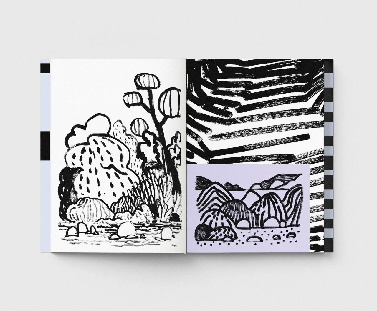
The German graphic designer’s project is designed to feel unfinished.
We’ve all got a place that’s dear to our heart, that we visited years ago, and which we have a clear picture of in our mind. It might be a country lane, a riverbank or simply a view from a train window. You’re convinced you can remember it like yesterday. And yet if you ever revisit it, years later, you’re often surprised by how different it looks in reality.
Memory is, let’s face it, not a reliable tool. Visual details in our minds blur, shift and get mixed together gradually, over time. It’s not a big problem – it’s just the way the brain works. And the important thing is, it’s not the way a place looks that’s truly important: it’s how it makes us feel that really matters.
That’s more or less the theme of Gone with the Clouds, a personal project by German graphic designer André Britz.
The space to stay curious
Living in a historic town on the Rhine, in the Cologne-Bonn area, André has spent more than two decades creating visual identities, digital experiences and illustrations for companies, start-ups, agencies and cultural institutions. But, he says, “In recent years, personal and artistic projects have become increasingly important to me. They give me the space to stay curious, experiment and get closer to developing my own creative voice. Gone with the Clouds is one of those independent and personal projects.”
The project consists of a collection of quick, intuitive landscape drawings and collages, all made from memory. André works without photos or sketches to guide him, and he doesn’t set out to depict any particular location.
“Landscapes emerge from images that have somehow remained in the mind,” he explains. “Details blur, shift or are reinvented. The pen follows the memory without a fixed plan.” The result, as he puts it, is “a series of landscapes that depict no specific place, yet still feel familiar”.
Confident lines
There’s a hazy, swirly nature to his pictures, in which winding paths snake into the distance, surrounding bushes are rendered as bold black blobs, trees are pared back to simple lollipop shapes and clouds are simply a few looping strokes. It’s all basic stuff, but there’s a confidence to André’s lines that means the compositions end up hanging together beautifully.
Accompanying the landscapes, meanwhile, is more abstract work: thick, gestural brushstrokes, a hand-drawn grid of rooftops, a dense tangle of lily-pad-like leaves. Smaller drawings are layered on top in panels of lilac, deep green and olive, giving the project as a whole a collaged, scrapbook feel.
André has now gathered all these drawings and collages together in a 64-page publication, subtitled “memory landscapes 25-26”. Its pale blue cover pairs a single drawing with a staggered, stacked title, and the whole thing is held together by a pink elastic band.
“The simple, open binding is part of the concept,” André explains. “The book feels unfinished and changeable, reflecting the nature of memory itself: something alive that shifts, takes new forms and can appear differently over time.”
That’s quite profound if you think about it. Most books are designed to fix their contents in place; this one gives you the freedom to shuffle the pages and put them back in a different order, if you’re so minded. In other words, it behaves a lot like memory does.
Leave a Reply