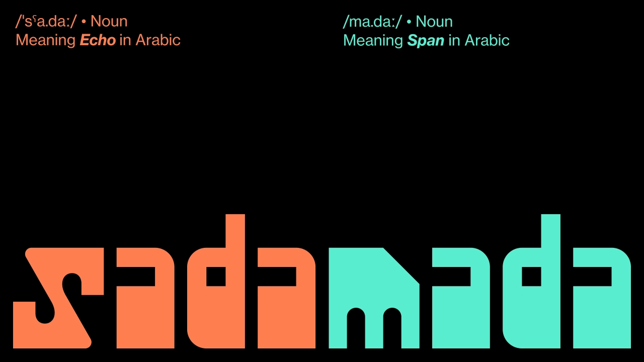
Led by Samar Maakaroun, these two identities for a maker space and event space highlight how strong brand architecture is built on discipline, not decoration.
Msheireb Downtown Doha is a planned city in Doha, the capital of Qatar, that’s designed to regenerate the historical district of Mushayrib (literally, ‘a place to drink water’ in Arabic). It’s been promoted as being the world’s first sustainable downtown regeneration project, and one of the smartest cities on Earth. And Doha Design District (DDD) is its hub for design, innovation, and collaboration.
Director Dana Kazic approached Samar Maakaroun and her team at Pentagram with a challenge: introduce two distinct spaces within the district, while strengthening, rather than fragmenting, the parent brand.
One would be a maker’s space dedicated to experimentation and artistic development; the other, an event space that becomes a destination for exhibitions, events, and public engagement. They’d be positioned physically opposite each other.
Striving for connection
It sounds like either a massive challenge or the stuff of nightmares, depending on how much experience you’ve had dealing with having to juggle the competing demands of brands and sub-brands, not to mention different languages.
In these scenarios, the client typically wants the two sub-brand spaces to feel connected. But in practice, they often get two names that share a typeface and a colour palette, but not much else. The connection is clearly expressed in a brand guideline PDF, yet never really translates to what the public actually sees and feels.
To avoid that scenario, Samar—whose identity for The Mosaic Rooms in London we covered back in April—and her team took the time to get things right. As they put it: “The relationship had to allow equity to move in all directions: from DDD to the sub-brands, between the sub-brands themselves, between languages, and back again into the wider district.”
Naming and letter design
Next up came the naming process. The team explored a range of ideas, from letter repetitions connected to the DDD symbol to Arabic words that had a spatial dimension and were easy to say out loud. The main thing was that the names needed to work together naturally and feel like two halves of a whole.
They found the solution in a pair of Arabic words that already had a relationship with each other. Mada, meaning range, reach or possibility, was chosen for the maker’s space. Sada, meaning echo, was chosen for the space where finished work meets an audience.
From a visual point of view, “sada” and “mada” are built from almost identical letterforms, mirrored and rearranged, rather than drawn from scratch as two separate typefaces. Or to put it another way, one looks like the echo of another. This means the relationship between the two spaces doesn’t need to be hammered home: it’s immediately, instinctively obvious.
At a deeper level, there’s a sense of culture and history baked into their DNA. Both names carry the letter D, which has been lifted from the existing Doha Design District symbol, while the other letterforms are inspired by the architecture of Msheireb, the downtown Doha district the whole scheme sits within.
Again, this works elegantly in making the whole brand architecture work harmoniously together. Every curve and notch in the wordmarks echoes something structural in the area, making them feel like a natural part of their surroundings, rather than something tagged on.
Key takeaway
Here’s what I think anyone working on a sub-brand can learn from this. It’s terribly easy, especially when you’re on a tight deadline, to go with the obvious solutions to making multiple brands work together. Use the same typeface, the same colour, the same grid system. And bosh! You have a unified system. Well, kinda.
This approach might look good in a presentation, but in the real world, where your designs are having to live, breathe and do their work, they run the risk of looking like an afterthought, stapled on to the parent brand rather than being an organic part of it.
What Pentagram did here was different. Rather than seeing the existing brand at surface level—the type, the colours—they delved deep into its ethos instead, and located the connective tissue that would make the new sub-brands feel naturally part of it.
The result? No one has to stand there explaining that Sada and Mada are part of the Doha Design District. It’s just obvious. And that’s the job.
Leave a Reply