Images courtesy of Thomas Adank, Ed Park and A Practice for Everyday Life.
Based not far from the museum itself, APFEL was the perfect choice when V&A East commissioned the graphics and signage for its new five-floor gallery in Olympic Park, Stratford.
Situated in the Stratford area of London, V&A East Museum is an excellent destination if you’re looking for creative inspiration – not just because of the exhibitions but also the graphics and signage that will guide you through the space. Developed by A Practice for Everyday Life – AKA APFEL – in conjunction with the architects JA Projects and the artist Larry Achiampong, the visuals include bespoke typography, and the graphics have been shaped in perfect harmony with the interior’s characteristics, fostering a natural flow that encourages appreciation for the pieces throughout the gallery.
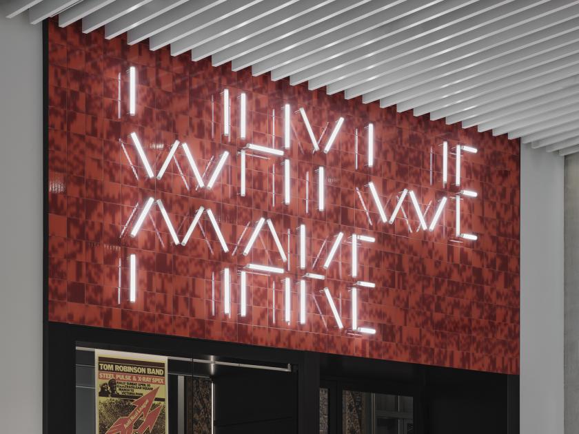
Opened in April 2026, the gallery’s permanent collection, called Why We Make, is introduced by a striking illuminated sign composed of lettering sublime in its simplicity. The design thinking behind the project is very much informed by the concept of making things, which in turn stems from East London’s industrial heritage.
A stencil font made from LED strips.
The secondary typeface for the hanging signage.
“The typeface is formed of individual, stencil-like strokes, formed of modular light fittings that ‘make’ up the letters,” explains APFEL co-founder Emma Thomas. “The galleries and exhibits are deeply rooted in the concept of making, and the typeface needed to reflect that. We broke the concept of the typeface down to its basic geometry – the component parts of what letterforms are made from.”
While the visuals reflect the area’s heritage, APFEL also wanted to put a strong emphasis on East London’s current-day community. The studio itself is part of that, located not far from the museum. Early in the project, APFEL engaged with the V&A Youth Collective, inviting young people to become co-designers from the outset and to participate in briefings and presentations, ultimately contributing ideas to the iterative design process.
Letterform suggestions from the V&A Youth Collective.
“We felt it was crucial to involve the people who would be using and experiencing the galleries – we wanted to make sure that they had truly impacted the design, and that we made something together,” continues Emma. “We hosted a collaborative workshop at our studio, inviting the V&A Youth Collective to help us design the display typeface to accompany the overall scheme.”
The interior architecture of V&A East Museum takes inspiration from East London’s urban landscape. It’s a little like the streets and neighbourhoods that form the cityscape, reinterpreted as a series of gallery spaces. This continues into the visual aspects APFEL has created, with each element carefully considered and intuitively linked to the area’s past and present character.
The type is part of how visitors flow through the space.
“Showcases with illuminated fascias and exhibition graphics draw on the language of shopfronts at the heart of local communities; timber cabinetry is crafted from London Plane trees; and displays of fashion, textiles, and ceramics echo how these materials are encountered in markets and stores across the four Olympic boroughs,” says Emma.
Following the principles of circular design was also an important part of APFEL’s approach. Working in consultation with Urge Collective, the designers focused on reusing available resources and local procurement, minimising any reliance on virgin materials. The illuminated lettering was made from LED lighting strips readily available in local markets.
After the display typeface was developed, a second font was designed with more solid letterforms for longer form curatorial messaging. “We created a custom version of the typeface that worked in this context, and was able to be cut out of metal to work for the hanging signs, or even as a rubber stamp used for an interactive activity station within the galleries,” says Emma.
Publication design for The Making of V&A East
The V&A also commissioned APFEL to design a book documenting the creative work carried out for the V&A East Museum, the wider V&A East development and the V&A East Storehouse.
Feedback on the projects has been fantastic – particularly regarding the illuminated signage. “It’s interesting to see it come into life now it’s installed. At night, it is reflected and refracted on various views as you look out of the windows across London. It brings the circulation spaces to life with a playful and dynamic aspect, and reiterates the themes of the exhibition in its building up of the word M-A-K-I-N-G quite literally,” says Emma.
Leave a Reply