The Slovenian graphic designer and recent Werkplaats Typografie graduate approaches typography with a messy, intuitive process, making work that is impossible to look away from.
Earlier this spring, Tjaša Cizej was staying at her parents’ place in Slovenia, surrounded by nature, and noticed buds on a branch. She had spent the previous two years in Arnhem, in the Netherlands, attending the Werkplaats Typografie master’s programme. “Maybe that has something to do with the fact that I spent a lot of time in cities over the last couple of years, and when I came back home, I became more aware of the beauty and ordinariness of the nature I grew up around,” she tells Creative Boom.
Tjaša started studying graphic design at 15, in high school in Slovenia, before going on to a bachelor’s degree at the Academy of Fine Arts in Ljubljana. She graduated from Werkplaats Typografie last summer and is now based in Arnhem, taking on client work and learning to build a variable font on the side. Her practice sits between typography, colour and printmaking, designing posters, identities and collaborative pieces that treat letters as forms to be pushed, pulled, recombined and, occasionally, made almost illegible (almost).
Her process, by her own description, is very messy and very simple. She doesn’t sketch beforehand. She starts with a letter and follows the feeling – you know, things like what colours appear first and what forms are starting to take shape. “I’m not professionally trained as a type designer, and honestly, I never really planned to become one,” she says. “Mainly, I’m just putting parts of letters together, almost like a puzzle.” The posters and identities that emerge from this approach are vivid and restless, awash with saturated colours, forms that hover between legibility and abstraction, and energetic compositions that seem to be communicating something with each line and dent.
Her personal projects are where she creates her favourite pieces, in part because they turned out well, but also because the process of making them was more “lighter and joyful” than others. The Kompas poster is one she is most attached to. Made during her time at Werkplaats Typografie, it involved working with traditional Chinese characters for the first time. “I liked discovering how I could find my own way of working with completely different letterforms,” she says. The poster was installed in the lightbox at the Werkplaats Typografie building in Arnhem, where it guided visitors in the right direction, giving the piece a functional dimension alongside its graphic one.
The Book Launch poster, made in collaboration with her classmate and friend Xiaohan Zhang, worked a little differently. Xiaohan provided images and drawing material, while Tjaša’s role was to respond, bringing her typographic and visual interpretation to what she was given. For this piece, she chose a photograph of a child hiding playfully and built around it with small typographic elements. “I’m very happy with how it resonated with the event itself and how everything came together,” she says. “It also brings back very nice memories of my classmates at Werkplaats Typografie.”
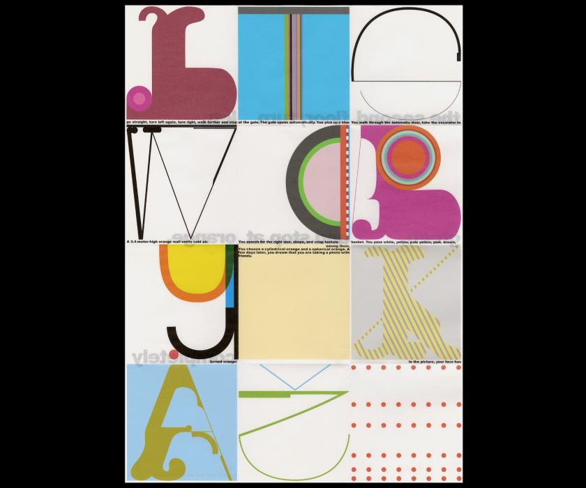
The Orange poster, on the other hand, features a grid of 12 uniform squares, each with its own identity. This isn’t necessarily a favourite of hers, but she enjoyed how the project pushed her towards printed matter and physical experimentation, a direction she wants to keep following. “It made me want to create more things like that.”
What Tjaša does not carry into the work is any particular expectation of how it should land. “I don’t carry any particular message or meaning in my work,” she says, “but it feels very good to express myself through it and to feel fulfilled by that.” This summer, she hopes to turn towards personal projects – potentially a first full typeface, and some interactive publications she has been thinking about for a while.
Leave a Reply