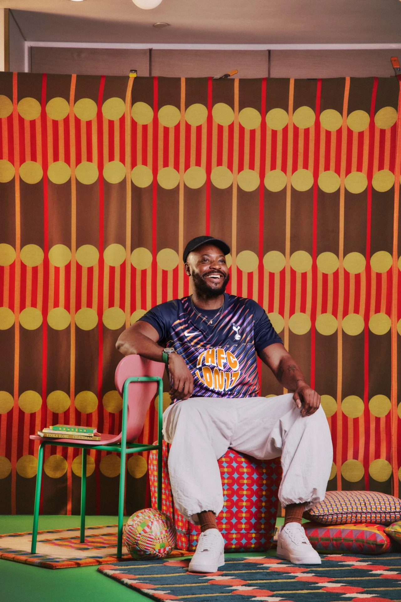
The British-Nigerian artist harnesses his signature colour, pattern and storytelling in a shirt design that celebrates North London’s community.
Let’s start with some honesty. I’m not really interested in sport, so when I think “football shirt”, I generally think of something basic, functional, and corporate-looking. People who know more about this stuff have told me, though, that football shirts are becoming one of the most interesting canvases in contemporary design.
Few feel more suited to this canvas than British-Nigerian artist and designer Yinka Ilori, who grew up on Essex Road in Islington, where he developed an appreciation for the area’s mix of cultures and communities. More recently, his relationship with Tottenham Hotspur Football Club has grown through his role as artist-in-residence at Heart of Hale, a mixed-use regeneration project in Tottenham Hale.
So it’s great news that Tottenham Hotspur has partnered with Yinka to reimagine its 2026/27 away shirt.
Trademark colour
Titled We Are Tottenham, Wherever We Go, it’s a great opportunity to bring Yinka’s trademark use of bold colour, pattern and storytelling into the world of football. The design subtly draws on the area’s diverse identity and strong sense of community, as well as Yinka’s own long-standing connection to north London.
At its heart is a basic but powerful idea: that football can bring people together across cultures and generations. That sits nicely alongside everything Yinka has made over the past decade and a half, from playgrounds to laundrettes.
But appealing across the board doesn’t mean these designs are a bland compromise: quite the opposite. The intense colours of this shirt (a deep navy base raked by streaks of pink, violet, orange and electric blue) are attention-grabbing in the best possible way. (In case you’re wondering, “THFC LDN17” stands for Tottenham Hotspur FC, London 17: a nod to the club’s N17 postcode.)
The back is just as striking and surprising. Lilac petals, chequered rings and turquoise bands surround the acronym “COYS”, which stands for “Come On You Spurs”. Running around that is a line from another popular Spurs chant, “I know I am, I’m sure I am”, while the outermost ring carries the collection’s title, “We Are Tottenham, Wherever We Go”, with Yinka’s name underneath.
So how did he get here? Yinka’s approach focused less on football itself and more on what happens around it.
“This project is a celebration of belonging and the power of football to bring people together,” he explains. “For me, football is about the wider culture and the incredible sense of unity that comes from standing on the terraces, chanting alongside thousands of others. I wanted the design to honour Tottenham Hotspur’s heritage while capturing that collective joy and spirit.”
Keeping busy
The collaboration caps a particularly productive spell for the designer. In September, he released a book titled Chairman, which traces the evolution of the chair practice that first made his name. An exhibition bringing together a decade of those chairs in one place for the first time is set to open in Islington.
Last year, Yinka was appointed a Royal Designer for Industry by the RSA, and he launched the Yinka Ilori Foundation, which aims to create playful, inclusive and sustainable community spaces for children and young people.
You may remember we covered his 100 Found Objects installation at Fulham Pier last summer, as well as his debut watch collection with MB&F’s M.A.D.Editions.
The Spurs shirt feels like a natural progression. Yinka typically uses colour, in his own words, “as a way of starting a conversation”. There are few conversations more animated than the ones that happen on match day. And putting his work on the backs of thousands of fans feels like a neat fit for someone who believes art and design should be accessible to all.
Leave a Reply