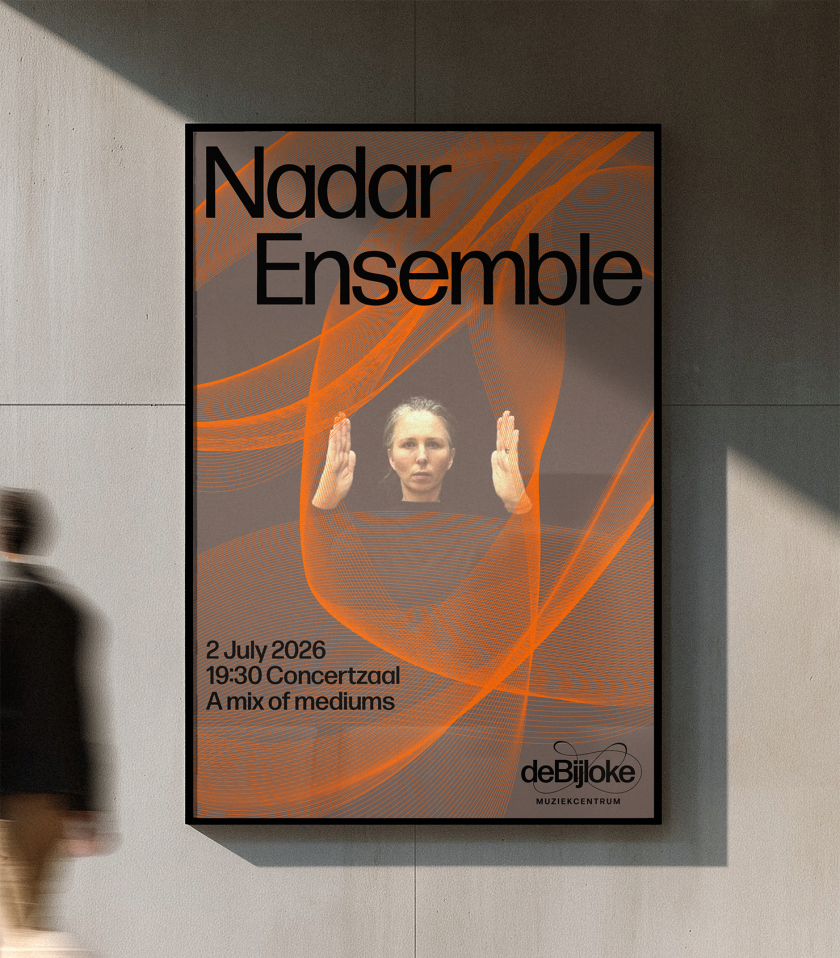
Marina and her team have overhauled the identity of one of Europe’s most respected music venues, and it’s inspired by American composer John Cage. We find out more.
The Muziekcentrum De Bijloke in Ghent is one of Europe’s oldest buildings that now acts as a concert hall for classical and contemporary music. Tucked beside a pretty open square, close to the River Leie, it’s been welcoming musicians from around the world since 2000. In a former life, it was a medieval hospital, founded in the early 13th century and run by Cistercian nuns. I urge you to look it up on Google Maps and browse the many street views around the venue because it’s gorgeous.
It’s had much success in its relatively new role. But ahead of its 2026/27 season, it approached Marina Willer and her team at Pentagram in London to refresh its brand. The brief was to create a “digital-first” identity to help it attract new music lovers, without turning off its loyal audience. It also wanted to reflect its many concert halls as living, breathing spaces within the venue, and to pitch the place as more open and diverse, active in international culture.
The result was a flexible and adaptable system that could scale with the ever-changing programme of musical events. It’s described as a “living identity” connected to sound, grounded in the idea that no two nights at De Bijloke are ever the same. The new brand position confirms it: “Alive in every moment. Past, present and future”.
What does it even mean to be “living”? Marina and her team were inspired by the American composer John Cage and his unconventional music methods. Experiments using the oscilloscope, for example – an analogue tool that visualises audio signals. Looking at the brand’s many swishes and swirls, you can also picture the treble clef on a sheet of music. This is what immediately springs to my mind.
The verbal language is described as evocative and intuitive, but “clear when it needs to be”, as Pentagram puts it. That’s whether the music hall is introducing itself as a gracious host or the thoughtful curator of its entire music programme.
In contrast to the logo, the typography is modern and elegant. It’s also confident, with sample letterforms from Forma DJR providing balance to the wider identity’s expressiveness. The palette is pleasing on the eye, too. Lots of grown-up pinks, teals, purples and blues. Pentagram took inspiration from the many different spaces inside the venue, picking out hues from arched ceilings, stone walls, sweeping stages and even the long curtains.
But that’s just the main identity. Pentagram also had to develop language for each musical programme. There’s De Bijloke Jazz, with patterns inspired by the genre’s improvisational, often chaotic nature. While De Bijloke New Music is more about the unexpected nature of “pushing an original shape one step further”, whatever that means. Looking at the design, you get the idea.
The Family programme has a more playful look. And there are three new patterns to represent each genre, plus a generative tool that De Bijloke can use to reinterpret whatever it likes. The result is a series of ever-changing forms, easily adaptable for motion and ready for export in any format. It allows complete ownership of its new brand system.
It’s a refresh for De Bijloke that celebrates its history and the breadth of its music programme. It feels alive and responsive rather than static. It can be both intimate and grand. But above all, it gives the venue a distinctive voice that suits every musician or concert it hosts in future. That’s surely worth applause alone.
Leave a Reply