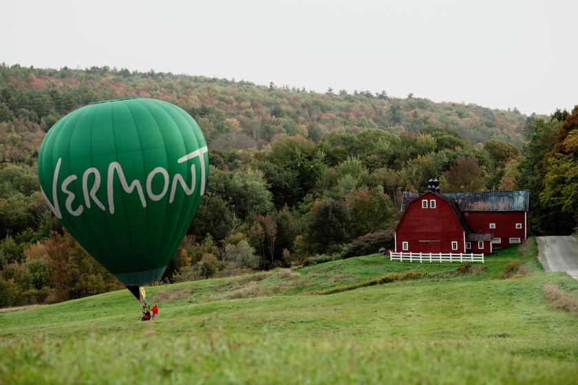
The studio behind San Francisco and DUMBO has given Vermont its first dedicated tourism brand, tackling a curious problem: nearly everyone likes Vermont, but hardly anyone books a trip there.
Here’s an interesting puzzle worth sitting with. Ask Americans what they make of Vermont and 79% will tell you it’s an appealing place to visit. Ask how many actually intend to go, though, and the number falls off a cliff to 15%.
That big gap is the whole reason the State of Vermont has just launched its first dedicated tourism brand, ‘State of Inspiration’, developed over nine months with London and New York place branding studio DNCO, the team behind identities for San Francisco, DUMBO in New York and Shanghai’s newest downtown, with past clients including the Mayor of London, Google and the British Museum.
The brief, boiled right down: Vermont has no shortage of charm. What it lacked was a reason to come now. “Our first read was that this wasn’t a product problem,” says Luis Mendoza, managing director of DNCO. “Vermont isn’t being rejected, it’s being overlooked.”
In fact, Vermont’s own 2025 research (national and Canadian traveller surveys, on-site intercepts, focus groups, resident and stakeholder surveys) laid the problem bare. The state ranks 30th nationally in advertising recall and trails its neighbours, Maine and Massachusetts, in brand visibility. And with tourism worth $4.2 billion a year in 2024, roughly nine per cent of Vermont’s GDP and about three times the national average, that invisibility comes with a real price tag.
DNCO found Vermont living in people’s heads in a very particular way. “It’s seen as idyllic and often seasonal. Something people admire, but don’t necessarily prioritise or plan around,” says Mendoza. “That creates a passive appeal.” So the job was never to make people like Vermont more. It was to give them a reason to act.
Here’s where it gets really interesting. The obvious move for a place like Vermont is to sell escape: switch off, slow down, get away from it all. Yet DNCO went the other way. “Findings from the research initially translated as offering people a place for escape,” Mendoza explains, “but our own research and conversations found that this positioning didn’t really surprise anyone; it didn’t do anything new to the brain. It also reminded many of the bad things from which we look to escape.” So they flipped the telescope round, from escaping to finding, gaining and learning.
The idea came from listening to visitors and locals describe moments like trying skiing for the first time, discovering 19th-century butter making, or even finding out how winemakers adapt to a cold climate. The data backed this up with 51% of visitors rating Vermont as a place to try something new, and 56% rated it highly for exploration.
“People weren’t describing a place where they switched off; they were describing a place where they levelled up,” explains Mendoza. “Vermont isn’t somewhere you plateau; it’s somewhere you leave having gained something.”
It’s a discovery that helped develop the brand’s new strapline. “We landed on ‘State of Inspiration’ because it captured that shift from escape to gain,” says Mendoza. “Moving Vermont from what you leave behind to what you gain from being here.”
All this nods to the physical state of rolling hills, changing seasons, ski slopes, and artist studios. But really, it points to a state of mind you carry home with you. And it stays deliberately open-ended, because inspiration looks different for everyone. Throughout the process, one word kept proving itself: inspiring.
Now for the identity itself. Anyone who has paid Vermont state taxes will know the “moon over mountains” mark, the official state symbol used across every agency. The tourism brand needed to feel relatable, but stand apart. Ha! Classic dilemma. “It was important to establish a new logo for the Vermont tourism brand to create space between the two,” says Mendoza, shifting the balance “from more corporate to more characterful and playful”.
The answer was hand-lettered, a tip of the hat to the hand-painted signs found along Vermont’s charming roadsides, storefronts and farm stands. Look closely, and the letterforms carry the landscape: the ‘e’ traces a winding road, the ‘m’ forms mountain peaks, the ‘o’ nods to that moon over the mountains.
It began, rather fittingly, with a paintbrush. “We started the process by hand painting the logo,” says Mendoza. Cramming a symbol into every letter would have been overkill, so the winding road in the ‘e’ was the one that felt natural. Working with UK type designer Rob Clarke, the team refined the wordmark for legibility, even bringing the ‘o’ down from above the mountain so it didn’t read as an ‘i’ – knowing they could raise it back up later with a bit of animation.
For the icon library, DNCO brought in Alyssa McCabe, an artist with long-term ties to the state, whose set includes Champ, the Lake Champlain lake monster (I kid you not). Why someone embedded in Vermont rather than an in-house job? “Stories are at the heart of this identity, and it was important to work with someone who had heard the stories of the state first-hand over the years and knew the personality of the people,” says Mendoza. McCabe mixes digital and physical processes, lino cutting among them, and the results are packed with nuance and character.
As you can see, it was a big project involving a lot of hands with a ton of engagement across Vermont’s tourism industry. The risk was the brand could easily have been lost along the way, but Mendoza explains why that didn’t happen: “If you aim to keep an idea ‘sharp’ you can be in danger of wilfully not listening,” he says. “That’s not the aim of co-creation.” Instead, DNCO went in to listen, bringing independent research as the agreed rules of the game and testing across five out-of-state markets. Vermonters, as it turns out, make excellent collaborators. “Like nearly every Vermonter we met, the state’s tourism professionals had this brilliant combination of friendliness, openness and straightforwardness. They told us when things didn’t work.”
Inspiration came from the people who know Vermont best. “They too may have come for the calm or the snow, but they had stayed for the inspiration,” says Mendoza.
There’s an even bigger reason this project is more important now: AI. With some studies suggesting as many as 75% of travellers used LLMs to plan their most recent trip, the destinations that don’t define their own narrative risk having it defined for them. “Because AI synthesises information from across the digital landscape, it is more important than ever for destinations to shape and clearly communicate their own narrative,” he says. “If they do not tell their story, others will tell it for them.” Or, as he put it more bluntly at launch: “If Vermont didn’t define its story itself, someone else would.”
Has DNCO’s input worked? The honest answer is that we won’t know for a while. The headline measures of success (visitation figures, campaign reach, advertising recall) will take years to read properly, with a follow-up brand study the real test of whether perceptions have shifted.
The more immediate measure is whether Vermont’s thousands of tourism partners take the brand on as their own. That’s what the onboarding workshops and toolkits are for: the “why” behind the brand, plus practical guidance on messaging, tone and language so every independent partner can tell the story in their own voice. “Every partner should sound like themselves,” says Mendoza, “but visitors should begin to recognise a consistent sense of Vermont across every experience.”
But early signs are promising. “The enthusiastic reception at last week’s launch suggests they very much are,” Mendoza says of the industry’s buy-in.
And for Heather Pelham, commissioner of the Vermont Department of Tourism and Marketing, that’s the whole point. “This new brand feels true to who we are as Vermonters,” she says, “while giving us a clearer story to share, inviting more people locally and globally to come and experience the inspiration that can be found here”.
Leave a Reply