A storybook serif, a Swiss workhorse and a riot of colour: we explore the typographic thinking behind United Us’s rebrand of Buttle UK.
When a charity’s biggest problem is that it’s too quiet, you don’t start with colour. You start with voice. And voice, in brand design, begins with type. That’s the lesson at the heart of United Us‘s rebrand of Buttle UK; a 70-year-old children’s grant-giving charity that, by its own admission, had been too modest for the scale of the problem it existed to address.
The Brighton agency’s response was a new identity built around a carefully orchestrated typographic system: three distinct tiers of type, each doing a specific job, each calibrated to a different emotional register. It’s a piece of work that repays close attention from anyone interested in how letterforms can carry meaning… far beyond the words they spell.
The problem with being understated
Buttle provides grants for things most of us take for granted: a bed, a coat, a laptop for homework, a school trip. These aren’t luxury items, but for children living in poverty, they can make a world of difference. The charity’s previous identity, while perfectly functional, lacked the emotional range to communicate that truth. It was, in the words of United Us partner Luke Taylor, a brand that needed to “spark conversation” rather than politely wait its turn.
The strategic pivot landed on a strapline—”For what matters in childhood”—that reframes the charity’s work away from the clinical language of crisis intervention and towards the child’s own experience. Everything that followed in the visual identity, typography included, had to serve that shift.
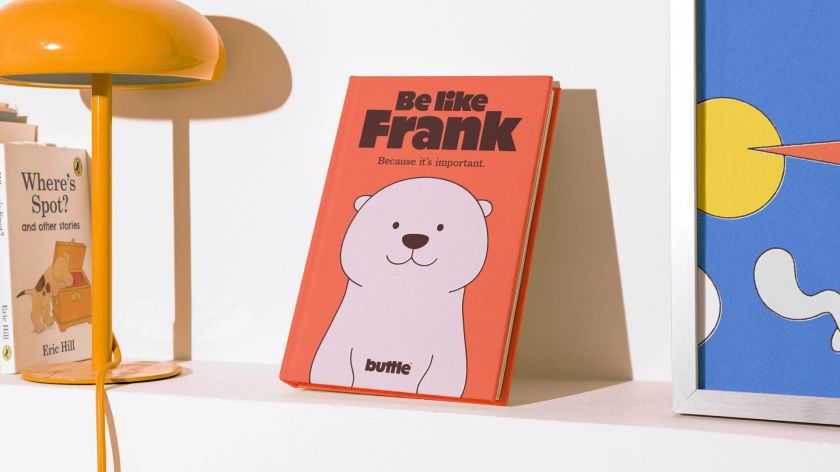
Reckless: the storybook voice
The centrepiece of the type system is Reckless, a serif face that immediately sets Buttle apart from the sans-serif default of much of the charity sector. It’s an interesting choice, and a confident one. Where many organisations reaching for “modern” or “accessible” would instinctively turn to a geometric sans, United Us went in the opposite direction: towards warmth, narrative and nostalgia.
Reckless carries what the agency describes as a “classic storybook feel”, and that makes perfect sense. Because the rebrand’s visual references aren’t contemporary children’s media but something older and more universal: the clean, emotionally direct illustration style of Miffy, Spot the Dog and Mr Benn.
Reckless sits comfortably in that world. Its letterforms have a gentle elegance without being precious, and critically, include child-friendly, single-storey forms for ‘a’, ‘g’ and ‘y’. It’s a detail that hugely matters for readability among younger audiences and readers with dyslexia.
Used at display scale across the website, impact reports and campaign materials, Reckless does the heavy emotional lifting. Lines such as “For what matters in childhood” and “Your impact, their story” gain a quiet authority from the typeface’s serif construction. At the same time, its slightly informal proportions prevent that authority from tipping into stuffiness.
It all reads as someone telling you something important in a warm, steady voice. Which is exactly the tone a charity like Buttle needs when it’s talking to donors, referrers and policymakers simultaneously.
Neue Haas Grotesk: the invisible backbone
If Reckless is the storyteller, Neue Haas Grotesk is the infrastructure. Deployed for body copy across all communications, it’s a choice that signals typographic literacy. Neue Haas Grotesk is, as you may know, the original drawing from which Helvetica was derived. But where Helvetica has been softened and homogenised through decades of ubiquity, Neue Haas Grotesk retains a crispness and character that rewards use at text sizes.
It works here precisely because you don’t notice it. In long-form reading (grant reports, policy documents, the charity’s website copy), it steps back entirely, letting the content breathe. The contrast with Reckless is instructive: where the serif speaks with personality, the sans speaks with clarity.
Together, they create a rhythm that moves between emotional engagement and informational transparency, mirroring the charity’s dual role as both storyteller and evidence-led organisation.
The pairing also solves a practical problem. Buttle communicates with an unusually wide range of audiences: children and young people, frontline social workers, individual donors, corporate funders, trustees and government bodies. A single typeface would struggle to address all of them credibly. The two-voice system lets the brand modulate its tone without ever feeling inconsistent.
Childhood type: the joyful disruption
The third tier is where things get properly playful. United Us developed a “childhood type” style: a bespoke, expressive treatment using bold, multicoloured block letterforms inspired by retro toys and vintage illustration. You can see it most clearly in the “Frank Mindset” lockup: oversized letters in green, blue, orange, yellow and pink, stacked and overlapping with a hand-drawn energy that’s completely unlike anything else in the system.
This treatment is used sparingly, and that restraint is what makes it effective. It appears for moments of impact (key statistics, campaign headlines, the word “armour” on a branded t-shirt), where a shot of pure, uncomplicated joy cuts through the otherwise measured tone. It functions almost like a child’s handwriting breaking into an adult conversation: disruptive, charming and impossible to ignore.
The colour palette here deserves a mention too, because it’s inseparable from the type treatment. While Buttle’s primary palette is stripped back to a deep brown-black on off-white (high contrast, highly accessible), the childhood type unlocks the full secondary palette of bold primaries and warm pastels.
The effect is of a brand that knows when to be serious and when to let colour and personality flood in. That discipline is harder to achieve than it looks.
The wordmark: hiding in plain sight
The Buttle wordmark itself is a quiet piece of craft. Set in a heavy, rounded lowercase, it carries a visual softness that belies its weight. The double ‘t’ forms the centrepiece, a motif carried over from the previous identity but reimagined as a more abstract, almost architectural element. There’s something of the building block about it, which feels intentional for an organisation whose work is about providing foundations.
The wordmark sits comfortably at small sizes on a phone screen and at a large scale on a presentation wall. That flexibility matters for a charity that needs to show up consistently across grant application portals, Instagram stories, impact reports and event signage.
Why it works
What makes this typographic system convincing isn’t any single element; it’s the relationships between them. Reckless provides emotional warmth and narrative voice. Neue Haas Grotesk provides neutrality and trust. The childhood type provides energy and distinctiveness. Each occupies its own territory, and the transitions between them feel natural rather than jarring.
It’s a system that’s been designed with operational awareness in mind. A charity of Buttle’s size doesn’t have an in-house design team producing every piece of collateral. The type system needs to be usable by non-designers producing internal documents, by external agencies creating campaign work, and by digital teams building web pages. The clarity of the three-tier hierarchy makes that possible; you always know which voice to reach for.
Overall, the Buttle rebrand is a useful case study in how typography can do strategic work. The typeface choices aren’t decorative; they’re argumentative. They make a case for what this charity is, who it speaks to, and how it wants to be understood. In a sector where visual identity is too often an afterthought—a logo refresh and a new colour swatch—that’s a welcome reminder of what thoughtful typographic design can achieve.
United Us hasn’t just given Buttle a new look. They’ve given it a voice with range.
Leave a Reply